This contributed content on inclusive web design is very timely for me.
As I build the next phase of my business online, my website will need a level up to host the online workshops I’m developing.
Initially, I’ll be hosting them on Teachable, but watch this space for updates, or book in for a webinar to find out how to create better content to add value to your business.
We often overlook inclusivity when designing our website, check out the link at the end to test your website.
All Inclusive Web Design
Your website is one of your most valuable assets whether you’re a multinational business or a sole trader. When designing your website then your focus will no doubt be on what it looks like and ensuring a constant stream of regular and relevant content. These are both important but an area often overlooked is how accessible your website is. Not just in terms of its navigation and signposting but whether it meets the individual and inclusive needs of your visitors.
There are guidelines and standards in place that a specialist website development agency will be very familiar with and will form part of their professional vocabulary. For the rest of us understanding web accessibility might seem like a daunting task. Here are some top tips for making your website more accessible.
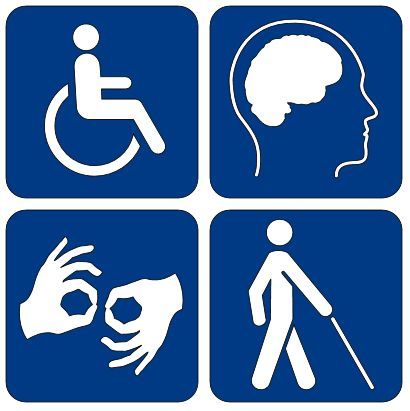
Image sourced from Monsido
Keep it simple
Good content should be easy to understand whether you’re reading on a screen or listening to it via a text reading tool. If you use long and complicated sentence structures, jargon or acronyms or words that are not in common use you will be creating a barrier for those visitors that are visually impaired or audio-dependent.
Navigation success
Good navigation allows your visitors to explore your website effectively and is vital for those visitors who are visually impaired or have developing computer literacy. Spend time thinking about how your visitors explore your website and then make important content easy to find. Menu items should be in larger fonts and the number of headings and subheadings kept to a minimum. Keep new or important content up front with no confusing redirects or pop-ups that will tie your visitors in knots and stop them ever landing on your page again.
Big is better
Font size choice puts your visitors in control. If people can scale up what they see on the screen it makes it easier for content to be read. You will also be appreciated for your forethought and it creates a relationship between you and your visitor based on mutual respect and trust.
Cool colour use
Don’t use colours to convey meaning – it assumes that all your visitors have the same visual and culture references. Keep colours for creating a brand identity and convey meaning in well thought out, simple and elegant prose. Don’t be afraid to use bold statement colours either just don’t use contrasts that make text difficult to read.
Make lists snappy
Avoid long lists at all costs, especially nested lists that can baffle even a professor let alone people with visual impairments. Lists should be kept short and snappy with key arguments or points highlighted.
Familiar scenery
Pages that are consistent in layout will not only make navigation easier but for those with visual limitations, it will provide a signpost for the information they need even if they find themselves on a new page.
Check that you’re meeting standards
If you really want to make sure your website is accessible why not get it checked out against industry standards using a web accessibility evaluation tool.
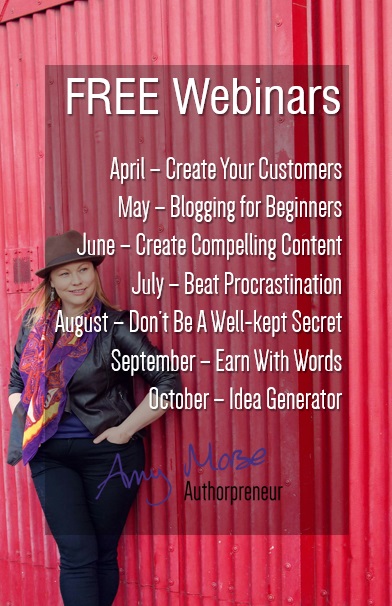
Book in for a FREE Webinar HERE


very handy tips, thank you
Booked into the webinars -looking forward to them
Thanks, Christine. I hope the webinars are useful to you?